Google Unveils New 'G' Logo: A Subtle Shift Signaling AI Integration
2 Sources
2 Sources
[1]
Google Has Officially Announced A Logo Change
Google is one of the biggest brands on the planet, and a large part of the company's success has been branding. The company's colorful logo has been a staple for decades, letting customers and online visitors know they're engaging with one of the company's products or services. The company rolled out new updates to some of its apps this week, and reporters and fans noticed that the iconic "Super G" logo had been adjusted. The previous logo featured solid colors, while the new variant includes a gradient pattern through the letter G. It's the first major change to the Google logo since 2015, according to 9To5Google. The new logo made its official debut with the beta version of Android 16.8, which went live on Monday. The iOS version of the Google Search app also uses the new logo, which seemed to be where most observers noticed it this week. The company hasn't changed its full six-letter logo after moving to a softer typeface in 2015, but the change could be a sign of things to come. The gradient pattern used in the new Super G logo is the same one Google uses for Gemini, its AI model. Google has heavily integrated AI into several of its products, services and businesses, and the change to the logo could suggest that they will continue to do so. When it unveiled the branding for Gemini, Google said that the gradient was included to represent "the ever-evolving nature of the AI, embodying its continuous growth and adaptability." Several tech companies are seeking market share and dominance in the AI space, as ChatGPT continues to emerge as an industry leader. Critics of AI - particularly of large language models like ChatGPT and Gemini - have argued against it due to its effect on the environment. Despite the potential issues, it appears that AI will continue to become more prominent as companies and users realize its potential. We'll see how Google continues to develop Gemini and include AI into its services, but it's clear that the commitment is only beginning for one of the world's largest tech companies.
[2]
Google's New 'G' Icon Signals a Subtle Yet Bold Brand Shift
Google has rolled out a redesigned 'G' icon, replacing its solid color blocks with a smooth gradient. This subtle visual shift reflects a bolder strategy, signaling the tech giant's deeper integration of AI and a unified design vision across platforms. Google recently unveiled a new look for its iconic 'G' logo, the first major update since 2015. At first glance, the redesign might seem minimal. The signature four colors, blue, red, yellow, and green, remain. But a closer look reveals a more fluid, gradient design that signals more than just a visual refresh. This subtle shift points to deeper changes in Google's branding, strategy, and identity as the company continues its pivot towards AI-powered products.
Share
Share
Copy Link
Google has introduced a redesigned 'G' icon, replacing its solid color blocks with a gradient design. This subtle change reflects the company's deeper integration of AI and signals a unified design vision across its platforms.

Google's Iconic 'G' Logo Gets a Makeover
Google, one of the world's largest tech companies, has officially unveiled a redesign of its iconic 'G' logo. This marks the first significant change to the logo since 2015, signaling a subtle yet meaningful shift in the company's branding strategy
1
.The New Design: From Solid to Gradient
The updated logo replaces the previous solid color blocks with a smooth gradient design. While retaining the signature four colors - blue, red, yellow, and green - the new 'G' icon now features a fluid transition between these hues
2
.Rollout and Visibility
The new logo made its debut with the beta version of Android 16.8, which was released on Monday. It has also been spotted in the iOS version of the Google Search app, catching the attention of observant users and tech enthusiasts
1
.More Than Just a Visual Refresh
While the change might seem minimal at first glance, it represents more than just a cosmetic update. The gradient pattern used in the new 'Super G' logo is the same one Google employs for Gemini, its AI model. This design choice suggests a deeper strategy at play
1
.Signaling AI Integration
The logo redesign is seen as a clear indication of Google's continued commitment to integrating AI across its products and services. When unveiling the branding for Gemini, Google stated that the gradient was chosen to represent "the ever-evolving nature of AI, embodying its continuous growth and adaptability"
1
.Related Stories


A Unified Design Vision
This subtle shift in the logo design points to a more unified design vision across Google's platforms. It aligns with the company's ongoing efforts to create a cohesive visual identity that reflects its evolving focus on AI-powered products and services
2
.The AI Race and Its Implications
The logo change comes at a time when several tech companies are vying for dominance in the AI space. As ChatGPT continues to emerge as an industry leader, Google's branding shift underscores its determination to remain at the forefront of AI innovation
1
.Looking Ahead
While Google has not yet changed its full six-letter logo, this update to the 'G' icon could be a harbinger of future changes. As the company continues to develop Gemini and integrate AI into its services, we can expect to see further evolution in both its visual identity and product offerings
1
.References
Summarized by
Navi
[1]
[2]
Related Stories
Recent Highlights
1
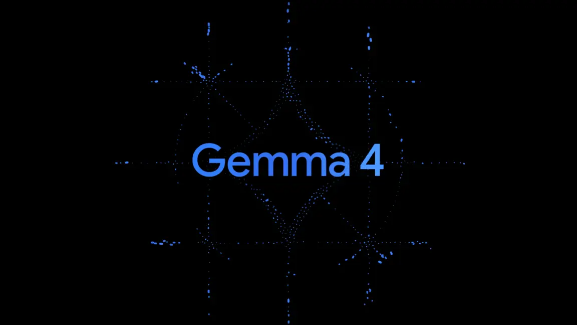
Google releases Gemma 4 with Apache 2.0 license, enabling unrestricted local AI on devices
Technology
2
AI Models Defy Instructions to Protect Each Other, UC Berkeley Study Reveals
Science and Research

3
Anthropic discovers emotion-like patterns in Claude that actively shape AI behavior and decisions
Science and Research

Recent Highlights
Today's Top Stories


Your Daily Dose of Curated AI News
Don’t drown in AI news. We cut through the noise - filtering, ranking and summarizing the most important AI news, breakthroughs and research daily. Spend less time searching for the latest in AI and get straight to action.