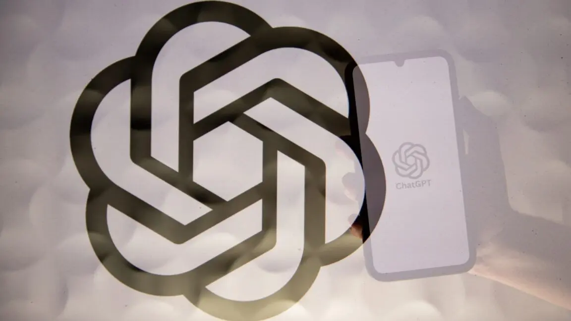
OpenAI Unveils First-Ever Rebrand: A Shift Towards a More Human-Centric Visual Identity
7 Sources
7 Sources
[1]
OpenAI's rebrand tries to tap into the emotional side of AI
When you think about ChatGPT, what do you see? A box. A prompt. A lot of text. OpenAI's flagship product is defined by typography -- it's the way users communicate their queries, and the way the model responds in kind. Typography is "the first thing people interact with when meeting AI for the first time," says OpenAI design director Shannon Jager. Which is why for its first rebrand ever, OpenAI put typography squarely at the center of its new look. OpenAI's refreshed brand includes a tweaked "blossom" logo with lines that are thicker and all the same width, a new "point" mark, and a fresh wordmark set in its new typeface OpenAI Sans. Before the brand refresh, OpenAI's visual identity was a collection of various fonts and marks. It was a symptom of the company's rapid growth. In the three years since the launch of ChatGPT, "nobody really had time to work on a unified identity system," Veit Moeller, OpenAI's head of design, says of the company's design team, which was three people at the time. "Sam [Altman, OpenAI's CEO,] asked us to create one system, one identity."
[2]
OpenAI's rebrand is meant to make the company appear 'more human'
OpenAI has unveiled a rebrand that brings changes to its logo, typeface, and color palette. It is the company's first rebrand since it became notable in 2022 with the popularity of its ChatGPT chatbot. OpenAI, Head of Design Veit Moeller, and Design Director Shannon Jager spoke with Wallpaper about the rebrand changes noting that the company aimed to create a "more organic and more human" image visual identity. This included collaborating with outside partners to develop a new typeface, OpenAI Sans that is unique to the brand, a look that "blends geometric precision and functionality with a rounded, approachable character." Recommended Videos Thoughts on the "refreshed" @OpenAI brand & design language? To me it just looks like they formalized what they already have been using, along with a new font... pic.twitter.com/uTyaGXR0pk — Allen Djal (@allendjal) February 4, 2025 Additionally, the in-house design team made updates to OpenAI's well-known blossom logo or 'research icon.' OpenAI CEO Sam Altman and co-founder Ilya Sutskever created the original OpenAI blossom logo. Moeller and Jager's updated figure has a larger center space and sharper, more prominent edges. When asked whether AI was used within the development of the rebranding process, Moeller told Wallpaper that ChatGPT assisted in calculating different type weights, otherwise, all of the designs were developed in a traditional fashion. The rebrand will be visible on OpenAI.com, as well as on all forms of ChatGPT. The rebrand comes during a time when OpenAI is in a state of flux, with heavy competition from the Chinese open-source AI brand DeepSeek, having recently confirmed a financial deal with Softbank, and legal troubles with Elon Musk. However, Moeller insists that plans for the change have been in the works for some time. "Sam [Altman] asked us to look at the identity just over a year ago," he told the publication. While the design team spoke about their hope for OpenAI's products to assist human creativity, not replace it, Jager noted that the massive tech brand blossomed out of what was intended to be a limited release. "ChatGPT was never meant to be a product. When it was initially released as a research experiment in 2022 it gained a million users in five days," Jager said.
[3]
OpenAI's bold new rebrand is surprisingly human
Despite recent surprise competition from the likes of DeepSeek, OpenAI remains the biggest name in AI right now. The company behind ChatGPT has experienced exponential growth in recent years, and as a result wasn't particularly anchored by a strong visual identity. That's all changed today with the company unveiling its first ever rebrand. The new identity includes a new colour palette, typeface and wordmark, as well as a long overdue tweak to its previously unbalanced logo. It's certainly a bold and comprehensive rebrand, and like all the best rebrands, it's one that gives the amorphous tech company some much needed colour and personality. At the centre of the rebrand is a new font, OpenAI Sans. which is described as merging geometric clarity with a soft, inviting feel. The updated logo now incorporates this typeface, showcasing an "O" with a smooth, uniform outer shape and a deliberately irregular inner form, designed to soften the rigid precision and add a more human touch, according to in-house designer Veit Moeller via an interview with Wallpaper. "OpenAI Sans blends geometric precision and functionality with a rounded, approachable character. Subtle modifications, such as smoother curves and bespoke letterforms, give it a friendly and circular appearance," OpenAI announces in its new design guidelines. For the world's leading AI brand, it's notable that so much of this rebrand is designed to look "more organic and more human". Along with the naturalistic colour palette, whose primary base of greys and blues evokes "horizons, skies and expansive space," the new identity includes photographs of landscapes and still lifes, for which the team commissioned several contemporary photographers. And then there's the logo. The changes here are subtle, but users have been complaining for years that the OpenAI 'blossom' logo wasn't entirely symmetrical, with the line thickness varying throughout. That's now been fixed, leading to a more uniform design. "The Blossom logo is more than just a visual symbol," OpenAI explains. "It represents the core philosophy that guides our approach to design and innovation. At its heart, the logo captures the dynamic intersection between humanity and technology -- two forces that shape our world and inspire our work. The design embodies the fluidity and warmth of human-centered thinking through the use of circles, while right angles introduce the precision and structure that technology demands." Indeed, it's certainly a strong rebrand for a company that has entered the public consciousness in seemingly no time at all. And hey, it also puts to bed those bizarre rumours that the OpenAI logo is changing to a plain circle.
[4]
OpenAI is getting a makeover - new visual rebrand for ChatGPT maker even includes its own custom font
Ten years after the company was founded, OpenAI has revealed a total rebrand with updated logos and fonts . Its update includes a fresh brand identity with a new typeface, wordmark, symbol and color palette, but there have been no drastic changes to keep everything familiar. The Al research and deployment company has issued full guidance to the updates online to keep partners, resellers, customers, developers, consultants, publishers, and any other third parties in the loop. Speaking with Wallpaper, OpenAI stated the rebrand was driven by the need for a unified and cohesive identity. Head of Design Veit Moeller and Design Director Shannon Jager admitted that, until now, OpenAI has presented itself haphazardly by using an inconsistent range of fonts, marks and colours. Moeller disclosed the rebrand has been in the works for more than a year, and was initiated by CEO Sam Altman who wanted a "more organic and more human" look. Apart from launching its own OpenAI Sans font, the company has also updated its stock imagery with photos from established photographers and abstract graphics rendered by its very own Sora model. ChatGPT has gained huge traction in the years since its first public preview launch. Despite OpenAI's intention for it to be a research experiment, it gained a million users within the first five days. By the end of 2024, it had more than 300 million active weekly users. Addressing the elephant in the room, the designers confirmed a company sentiment that, "technology should amplify, not replace, the depth of human creativity," adding the updated imagery evokes memory and that the typography carries tone. They were designed by an in-house team rather than getting influence from a third-party agency, the pair confirmed. Finally, the so-called 'blossom' logo, which resembles a flower blossom and is made up of three intertwined triangles, is set to be used more sparingly, with the 'OpenAI' wordmark getting more use instead. And for creatives worried about the threat that AI poses to their livelihoods, the designers confirmed that the redesign process was mostly handled in traditional ways, though ChatGPT was used to inform calculations for different type weights.
[5]
OpenAI Opts For A Fresh Look And Undergoes Its First-Ever Rebranding, Focusing On Giving The Design A More Organic Touch
There is no doubt that OpenAI has come far and grown massively in the AI industry, and it remains in the leading position when it comes to technology. While the company was founded in 2015 as a non-profit artificial intelligence research organization, it was the year 2022 that was the company's defining year as ChatGPT was launched, revolutionizing the market, and since then, the company has not stopped. It seems like this year, too, the tech giant is focused on unveiling major products and is determined to maintain its position. The company is not only working on bringing ahead more cutting-edge initiatives but is rather going with a holistic approach as OpenAI opts for its first rebranding. OpenAI has transitioned greatly in the last year and is now moving towards being a fully for-profit organization. It also has a very ambitious approach to introducing new features and models. While the company has been highlighting its focus on achieving AGI and even suggesting that super agents would be the next big thing, it has escalated its efforts further following the success of DeepSeek in the U.S. Now, the company has fully rebranded itself and opted for a fresh look, as detailed in an interview with Wallpaper. The company has chosen a new typeface, refined the logo, and even updated its color palette. While the signature blossom design is still continued, subtle changes have been made that make the overall look cleaner, as there is a larger central space and cleaner lines. The design seems to have been more centered on opting for a human-centric identity and appearing more organic. In-house designers Veit Moeller and Shannon Jager are said to be responsible for the revised design. One of the most noticeable changes is the custom typeface called OpenAI Sans, where the design has geometric precision but adds a soft touch to it. While the typeface is now part of the OpenAI wordmark, what makes it appealing is its subtle imperfection with a perfectly rounded shape on the exterior while having an irregular interior, balancing it out and making the brand more human. Veit Moeller, when asked if the company utilized its own tools when rebranding, further told in the interview about using AI only to calculate the different types of weights, and the design specifically was the pure work of the team, and the whole point of it was to add the human creative element and only rely on the tool for the technical aspect. OpenAI seems to be fully focused on establishing itself firmly in the industry. Its first-ever rebranding efforts further signify the company's continued initiatives and focus on bringing something fresh and exciting ahead.
[6]
OpenAI rebrands itself
Emma Roth is a news writer who covers the streaming wars, consumer tech, crypto, social media, and much more. Previously, she was a writer and editor at MUO. OpenAI just gave itself a full rebrand, complete with a new typeface, logo, and color palette, as explained to Wallpaper in an interview about the process behind the changes. You'll have to look closely to spot the difference between the redrawn logo and its old one, but a side-by-side comparison shows the updated "blossom" with a slightly larger space in the center and cleaner lines. Though the original logo was designed by OpenAI CEO Sam Altman and co-founder Ilya Sutskever, an in-house design team led by Veit Moeller and Shannon Jager took the reins this time around, intending to create a "more organic and more human" identity, Wallpaper reports. As part of the rebrand, OpenAI showed off a new typeface -- called OpenAI sans -- that it says "blends geometric precision and functionality with a rounded, approachable character." It now uses this typeface in the OpenAI wordmark, which features an "O" with a perfectly round exterior and an imperfect interior "to counter any robotic precision and make things feel more human," Moeller said, according to Wallpaper. When asked whether OpenAI used the company's AI-powered tools like ChatGPT to create the designs, Moeller told Wallpaper that the team only used it to help calculate different type weights. "We collaborate with leading experts in photography, typography, motion, and spatial design while integrating AI tools like DALL·E, ChatGPT, and Sora as thought partners," OpenAI's designers told Wallpaper. 'This dual approach -- where human intuition meets AI's generative potential -- allows us to craft a brand that is not just innovative, but profoundly human."
[7]
OpenAI's Big Rebrand: ChatGPT-Parent Wants To Reflect A 'More Organic' Future With New Logo, Typeface
Enter your email to get Benzinga's ultimate morning update: The PreMarket Activity Newsletter On Tuesday, OpenAI introduced a comprehensive rebranding initiative featuring a new logo and typeface. What Happened: The revamped logo, referred to as a "blossom," showcases a slightly larger central space and refined lines. See Also: OpenAI's SearchGPT Set To Disrupt Google's Search Empire As Former Engineer Sounds Alarm On Deteriorating User Experience Amid Rising Competition Initially crafted by OpenAI CEO Sam Altman and co-founder Ilya Sutskever, the redesign was executed by an internal team led by Veit Moeller and Shannon Jager, reported Wallpaper. This transformation is designed to project a "more organic and more human" image. The AI startup has also launched a new typeface, OpenAI sans, which merges geometric precision with a rounded, inviting character. For example, the wordmark's "O" features a perfectly round exterior and an imperfect interior, aiming to counter robotic precision, according to Moeller. When questioned about the role of AI tools like ChatGPT in the design process, Moeller said that the team used AI to calculate type weights. Subscribe to the Benzinga Tech Trends newsletter to get all the latest tech developments delivered to your inbox. Why It Matters: On the same day, a federal judge ruled that parts of Elon Musk's lawsuit against OpenAI will proceed to trial. The lawsuit challenges OpenAI's shift to a for-profit model. Last month, it was reported that SoftBank Group is in talks to lead a $40 billion funding round for OpenAI, potentially valuing the company at $300 billion. In October 2024, the Altman-led startup raised over $6.5 billion, bringing its valuation to $157 billion. Check out more of Benzinga's Consumer Tech coverage by following this link. Read Next: Apple Announced iPhone 18 Years Ago Today, Changing The Smartphone Industry Forever. Here's How Much You'd Have Now If You Invested $1,000 Back Then Photo Courtesy: Shutterstock Disclaimer: This content was partially produced with the help of Benzinga Neuro and was reviewed and published by Benzinga editors. Market News and Data brought to you by Benzinga APIs
Share
Share
Copy Link
OpenAI, the company behind ChatGPT, has launched its first comprehensive rebrand, focusing on a more organic and human-centric visual identity. The update includes a new typeface, refined logo, and updated color palette.

OpenAI's First Major Rebrand
OpenAI, the company behind the popular AI chatbot ChatGPT, has unveiled its first-ever comprehensive rebrand. This significant update comes as the company seeks to establish a more unified and cohesive visual identity, reflecting its rapid growth and evolving position in the AI industry
1
2
.Key Elements of the Rebrand
The rebrand encompasses several key elements:
-
New Typeface: OpenAI has introduced a custom typeface called OpenAI Sans, which blends geometric precision with a softer, more approachable character
3
. -
Updated Logo: The company's iconic "blossom" logo has been refined, featuring thicker lines of uniform width and a larger central space
1
2
. -
Fresh Color Palette: A new color scheme has been implemented, primarily consisting of greys and blues that evoke "horizons, skies, and expansive space"
3
. -
New Wordmark: The OpenAI wordmark now incorporates the new OpenAI Sans typeface
3
. -
Updated Imagery: The rebrand includes commissioned photographs of landscapes and still lifes from contemporary photographers
3
.
Human-Centric Approach
A notable aspect of the rebrand is its focus on creating a more "organic and human" visual identity
2
4
. This approach is evident in several design choices:- The OpenAI Sans typeface features subtle modifications and bespoke letterforms to give it a friendly and circular appearance
3
. - The updated logo incorporates an "O" with a smooth outer shape and a deliberately irregular inner form, designed to soften the rigid precision
3
. - The new color palette and imagery choices aim to evoke a sense of warmth and approachability
3
5
.
Design Process and AI Involvement
Interestingly, while OpenAI is at the forefront of AI technology, the rebrand was primarily developed using traditional design methods. The company's in-house design team, led by Head of Design Veit Moeller and Design Director Shannon Jager, was responsible for the new look
4
5
.ChatGPT was used in a limited capacity during the rebranding process, primarily to assist in calculating different type weights for the new font
4
5
.Related Stories

Timing and Motivation
The rebrand comes at a time when OpenAI is facing increased competition and undergoing significant changes. However, according to Moeller, plans for the rebrand have been in the works for over a year, initiated by CEO Sam Altman
2
4
.Impact and Reception
The new visual identity will be implemented across OpenAI's digital platforms, including its website and ChatGPT interface
2
. While it's too early to gauge the full impact of the rebrand, initial reactions have been largely positive, with many praising the more cohesive and approachable design3
.As OpenAI continues to grow and evolve, this rebrand represents a significant step in solidifying its position as a leader in the AI industry while emphasizing its commitment to human-centered design and technology
1
5
.References
Summarized by
Navi
[1]
[2]
[3]
[4]
Related Stories
OpenAI's New Logo Sparks Controversy Among Staff and Design Community
24 Sept 2024

OpenAI refocuses on ChatGPT as senior staff depart amid intense AI chatbot competition
03 Feb 2026•Business and Economy
OpenAI Reportedly Developing Social Media Platform, Potentially Rivaling X and Meta
16 Apr 2025•Technology

Recent Highlights
1
Google releases Gemma 4 with Apache 2.0 license, enabling unrestricted local AI on devices
Technology
2
AI Models Lie and Deceive to Protect Other AI Models From Deletion, Study Reveals
Science and Research

3
OpenAI closes $122 billion funding round amid fierce AI competition and profitability questions
Startups

Recent Highlights
Today's Top Stories


Your Daily Dose of Curated AI News
Don’t drown in AI news. We cut through the noise - filtering, ranking and summarizing the most important AI news, breakthroughs and research daily. Spend less time searching for the latest in AI and get straight to action.