State Department's AI-Generated Map Mislabels Every African Country at Global AIDS Conference


3 Sources
[1]
Mislabeled U.S. map of Africa was made with AI tools, Reuters finds
Mislabeled U.S. map of Africa was made with AI tools, Reuters finds A U.S. government map of Africa mislabeled every country during a State Department presentation at the AIDS 2026 conference in Rio de Janeiro this week, causing a stir among attendees who took screenshots and posted them online. A
[2]
US Government Displays AI-Mangled Map of Africa That Gets Every Single Country Wrong
Can't-miss innovations from the bleeding edge of science and tech This government sure loves its AI slop, doesn't it? While presenting at the global AIDS 2026 conference in Brazil this week, officials at the US State Department proudly displayed a map of Africa that seemed to be beamed from an
[3]
The State Department Presented an Error-Filled Map of Africa. What Happened Next Is a Warning for Every CEO Using AI
Nigeria in the middle of the Sahara? The Ivory Coast somehow shifted to the wrong side of the continent? What could cause such a catastrophic mess? Not a terrifying earthquake, it turns out. Instead, this geographical confusion was a highly public mistake apparently caused in part by an AI
Share
Copy Link
A US government presentation at the AIDS 2026 conference in Rio de Janeiro featured a catastrophically incorrect AI-generated map of Africa that mislabeled every highlighted country. Reuters analysis uncovered an OpenAI watermark, revealing the map was created using AI tools without proper verification.
State Department Presents Catastrophically Flawed Map at Global Health Conference
The State Department displayed a severely flawed AI-generated map of Africa during a presentation at the AIDS 2026 conference in Rio de Janeiro this week, mislabeling every single country it highlighted
1
2
3
. Jeff Graham, the department's lead US health envoy overseeing the President's Emergency Plan for AIDS Relief program, presented the map while discussing new health agreements and funding opportunities in African nations3
. Conference attendees immediately spotted the errors and captured screenshots that spread rapidly across social media platforms.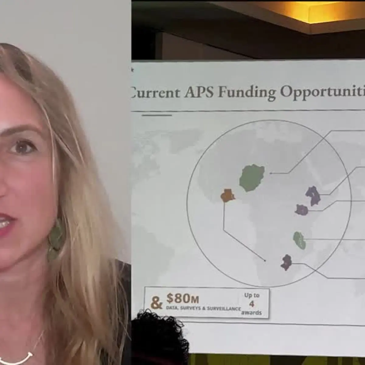
Source: Reuters
Geographic Errors Reveal Complete Lack of Oversight
The mislabeled map of Africa contained glaring geographical mistakes that should have been caught with even cursory review. Nigeria, a coastal nation, appeared in the middle of the Sahara Desert
2
. Mozambique was relocated from southeastern Africa to the Horn of Africa2
. The Ivory Coast, named for its coastal location, was depicted as a landlocked country2
. Uganda and Malawi had incorrectly drawn borders2
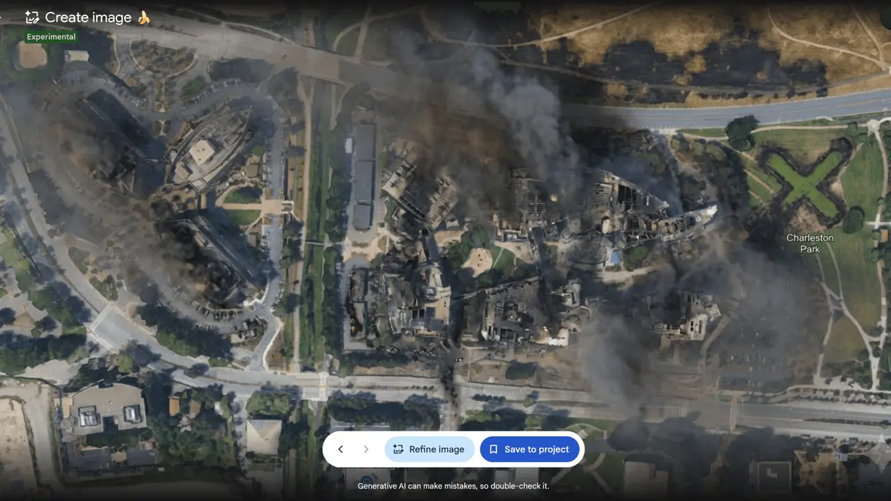
. These errors occurred in a presentation meant to outline where the US government map would commit health funding, making the mistakes particularly problematic for African partners attending the conference.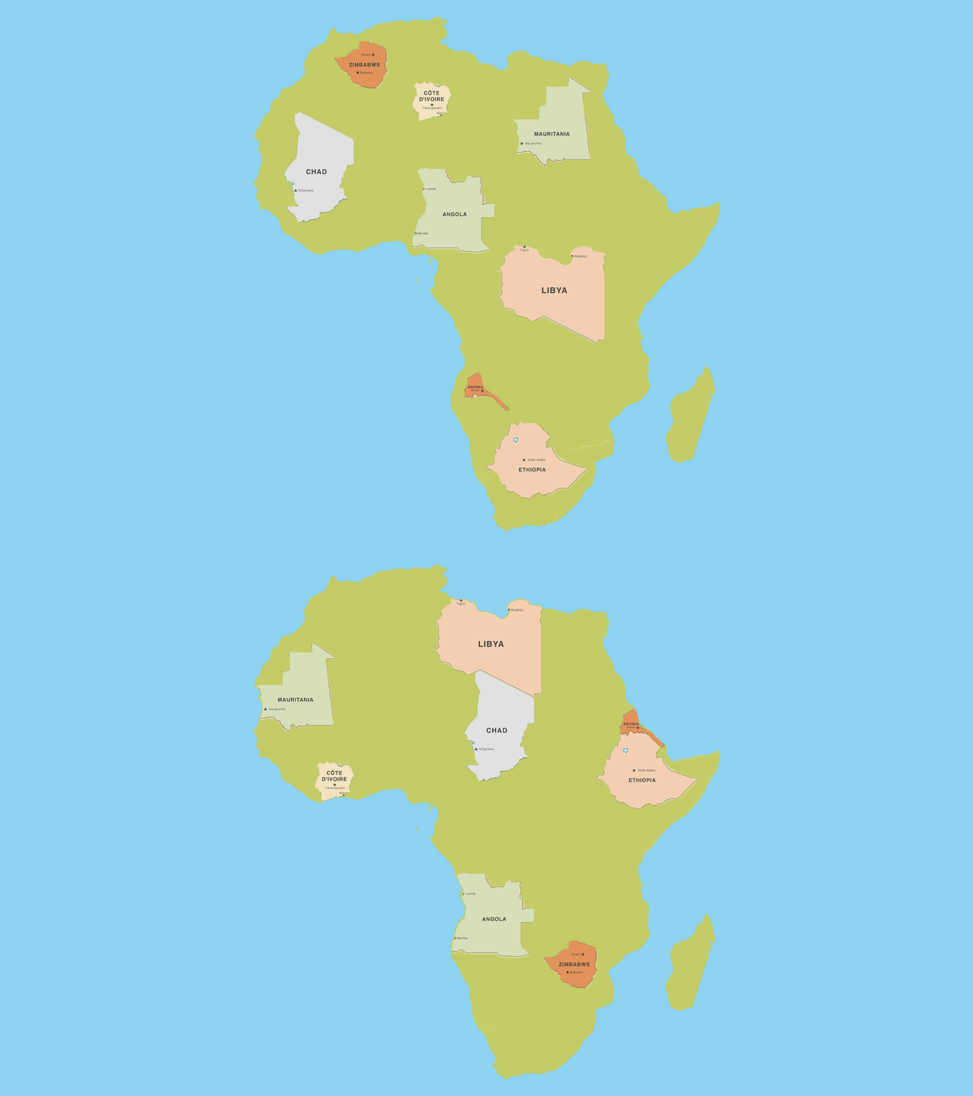
Source: Inc.
Reuters Investigation Uncovers OpenAI Watermark
A Reuters analysis of the map revealed it contained an AI watermark indicating it was generated using OpenAI tools
1
3
. This discovery transformed what initially appeared to be simple human error into a case study of AI-generated content deployed without proper verification. OpenAI stated it was investigating the report1
. The presence of the watermark demonstrates how AI tools can produce plausible-looking outputs that contain fundamental inaccuracies, especially when users fail to verify the results.Expert Commentary Highlights Accountability Crisis
Matt Petit, an expert on AI and geopolitics at the Atlantic Council, captured the broader implications in a post that garnered over 40,000 views: "Whoever created and approved this slide did not know where countries in Africa are and did not care to check their work"
2
. AIDS expert Emily Bass first flagged the error in a Substack post that went viral on LinkedIn2
. The incident sparked immediate discussion among the thousands of professionals attending the world's largest HIV and AIDS conference, raising questions about the State Department's commitment to its African partnerships.State Department Accepts Responsibility, Cites Rushed Timeline
The State Department issued a statement taking "full responsibility for the confusion and misrepresentation it caused for attendees, including our African partners"
2
3
. Officials attributed the "unfortunate error" to "a team member who hastily altered the slide deck immediately before the presentation"2
3
. This explanation reveals a critical failure point: when time pressure meets AI tools, the combination can bypass essential quality control measures. The department's acknowledgment underscores how AI-generated content requires the same rigorous review as any other official material.Related Stories
Broader Context: HIV/AIDS Funding and Administrative Priorities
The mapping disaster occurred against a troubling backdrop for global HIV/AIDS efforts. The Trump administration cut funding to the President's Emergency Plan for AIDS Relief program, or PEPFAR, the largest HIV prevention program worldwide
2
. A recent study documented that over 1,700 HIV treatment sites shut down after losing funding as part of the administration's dismantling of USAID2
. The AI-generated map incident at the AIDS 2026 conference thus symbolizes a larger pattern of diminished attention to global health partnerships.
Source: Futurism
Warning Signs for Organizations Deploying AI
This incident serves as a cautionary tale for any organization integrating AI tools into workflows. The State Department's error demonstrates three critical vulnerabilities: over-reliance on AI-generated outputs, lack of oversight in verification processes, and the dangers of deploying AI tools under time pressure. When staff members use AI to complete tasks quickly without subject matter expertise to catch errors, the results can damage credibility and relationships. The mislabeled map of Africa shows that AI tools, despite their sophistication, still produce outputs requiring human judgment and accountability before public presentation.
References
Summarized by

Navi
Related Stories
South Africa withdraws AI policy after discovering it cited fake AI-generated research
27 Apr 2026•Policy and Regulation

National Weather Service AI hallucinations invent fake Idaho towns on weather maps
07 Jan 2026•Technology

AI-Altered Image of Alex Pretti Reaches US Senate Floor, Exposing Misinformation Crisis
31 Jan 2026•Entertainment and Society

Recent Highlights



Recent Highlights
Today's Top Stories






Don’t drown in AI news. We cut through the noise - filtering, ranking and summarizing the most important AI news, breakthroughs and research daily. Follow topics that matter to you and stay ahead.


